Kerby Anderson
“The global discussion about climate change has become quite hysterical.” That is how Bjørn Lomborg begins his commentary on “Life after Climate Change.” He has always said that climate change is real and a man-made phenomenon, but he laments that the catastrophic narrative is drowning out relevant facts about climate change.
He provides eight graphs that provide a message that needs to get out to the public. If you have been listening to my commentaries, you have heard some of these because he has written about them in the past.
First, hurricanes are not getting stronger or more frequent. If you look at the graph he provides, you will see that hurricanes last year were unprecedented – in their weakness.
Second, we hear that climate change is killing more people because of rising temperatures. We rarely hear that cold kills many more than heat. Also, climate-related deaths have dropped significantly.
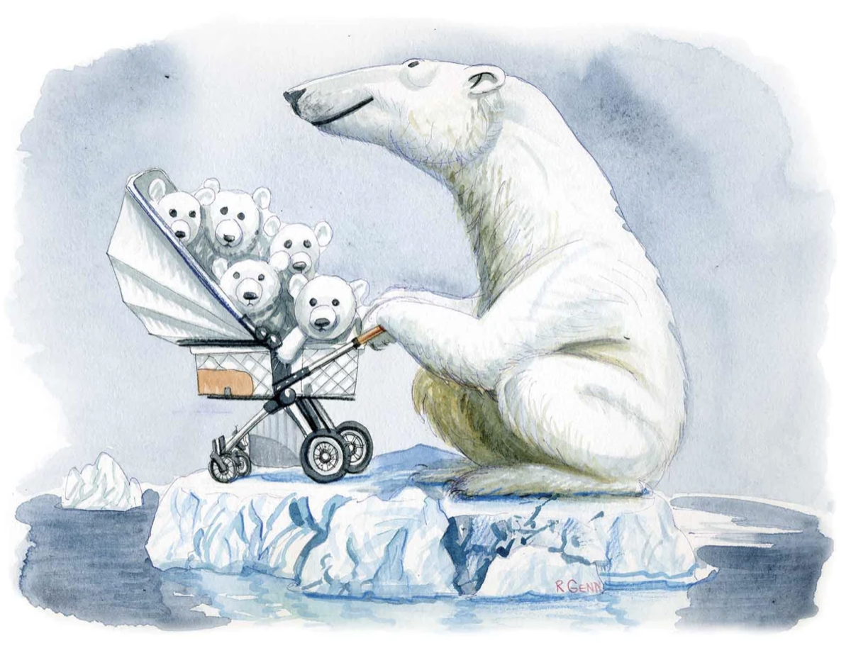
What about the polar bears? Climate activists have used the polar bear as an iconic image of a looming apocalypse. But the numbers of polar bears are increasing not decreasing.
What about all the wildfires? Although fires are routinely hyped in climate coverage, the percent of land worldwide burned each year has declined over the last century and continues to decline.
He also provides graphs that show that the solutions may be overhyped. For example, the global share of renewable energy has only increased slightly. The most renewable continent is Africa because half of its energy comes from wood, dung, and cardboard burned for cooking and heating.
Finally, there is the question of how all this can be paid for. That graph shows the enormous cost of going net-zero. That is why he says (and I agree) that climate change is an important issue but is not the end of the world. 
 Listen Online
 Watch Online
 Find a Station in Your Area


 Listen Now
 Watch Online
